Layout
Component Search
Find the perfect component for your project.
Recent searches
Quick filters
Popular results
View all
Stacked Layouts
Application UI components for stacked layouts
Tables
Data table components and examples
Sidebar Navigation
Flexible navigation components for your application's sidebar.
Simple Sidebar

Nested Navigation
Icon Sidebar
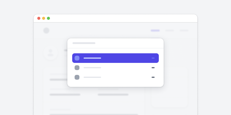
With User Profile
Tom Cook
View profile
Components
Browse our collection of prebuilt components.
Stacked Layouts
9 components
Tables
20 components
Form Layouts
5 components
Sign-in Forms
5 components
Input Groups
21 components
Command Palettes
9 components
Browse by category
Component Preview
Profile Overview
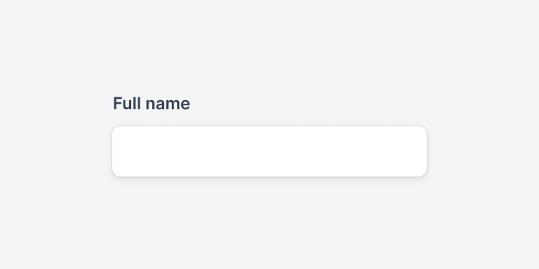
Personal Information and Options
- Full name
- Tom Cook
- tom@example.com
Description
This component demonstrates a clean and modern profile overview layout with user information and action buttons. Perfect for dashboard interfaces and user management systems.
Properties
- Category
- Application UI
- Last updated
- 2 weeks ago
Component Code
<div class="max-w-md mx-auto bg-white shadow-sm rounded-lg overflow-hidden">
    <div class="px-4 py-5 sm:px-6">
        <div class="flex items-center justify-between">
            <div class="flex items-center">
                <div class="flex-shrink-0">
                    <img class="h-12 w-12 rounded-full"
                         src="/avatar.jpg"
                         alt="User avatar">
                </div>
                <div class="ml-4">
                    <h3 class="text-lg font-medium text-gray-900">
                        Profile Overview
                    </h3>
                    <p class="text-sm text-gray-500">
                        Personal Information
                    </p>
                </div>
            </div>
            <button class="rounded-md bg-white px-3.5 py-2.5
                           text-sm font-semibold text-gray-900
                           shadow-sm ring-1 ring-inset
                           ring-gray-300 hover:bg-gray-50">
                Edit
            </button>
        </div>
    </div>
</div>
Documentation
Installation
Install the required dependencies:
npm install @tailwindcss/ui
Usage
Import and use the component in your project:
import { ProfileCard } from '@tailwindcss/ui'
Props
- name
- string
- string
- avatar
- string (URL)
Component Variants
Simple
Tom Cook
tom@example.com
With Actions
Floyd Miles
floyd@example.com
Detailed
Emily Selman
emily@example.com
Role
Designer
Department
Product
Documentation
Learn how to integrate and customize components in your projects.
Getting Started
Learn how to get up and running with our component library in just a few minutes.
npm install @tailwindui/componentsOnce installed, you can import components directly in your project:
import { Button, Card } from '@tailwindui/components'Installation
Using npm
Recommended for most projects
Using CDN
Quick setup for prototypes
Configuration
Add the following to your tailwind.config.js:
module.exports = {
  // ...
  plugins: [
    require('@tailwindui/components')
  ]
}
API Reference
Props
| Name | Type | Default |
|---|---|---|
| variant | string | 'primary' |
| size | string | 'md' |
Simple, transparent pricing
Everything you need to build modern UI interfaces.
Personal
Perfect for side projects and simple websites.
- Over 500+ components
- Use on 1 project
- Lifetime access
Team
For small teams working on multiple projects.
- Everything in Personal
- Use on unlimited projects
- Team access
Enterprise
For large teams and organizations.
- Everything in Team
- Priority support
- Custom licensing
Frequently asked questions
Can I use components in multiple projects?
Yes, depending on your license. Team and Enterprise plans include unlimited project usage.
Do you offer refunds?
Yes, we offer a 30-day money-back guarantee for all purchases.